


Key Insight
Verifying a seller's explanation for revenue growth requires four checks, and the order matters because a false result can pass the first two. First, scale the stated cause to the size of the market: a measure that grows simply because the place is bigger is measuring the place. Second, identify a control — a nearby business type that should not have benefited — and confirm it did not move. Third, ask what else the affected places have in common, because a variable correlating with a region produces genuine-looking results for the wrong reason. Fourth, compare like with like by restricting to the same market. A worked example using NOAA Storm Events data across 2,990 counties and Census County Business Patterns demonstrates the failure mode: roofing establishments in high storm-damage counties grew 7.1% from 2021 to 2023 against 5.7% elsewhere, a 1.4-point gap, with a dentist placebo that was perfectly flat. The result looked correct. But 61% of high-damage counties are in the Sun Belt or Tornado Alley, the same states that absorbed the largest business migration in that window, so the storm variable was functioning as a proxy for regional growth. Comparing storm-hit counties only against others in the same state, roofing falls to −0.94 points and holds in just 15 of 33 states — a coin flip — while the placebos remain near zero, confirming the test works rather than being broken. Auto body repair is the sole survivor at +1.76 points across 25 of 40 states, consistent with hail damaging vehicles. The general lesson for diligence is that a clean control group and a large sample do not protect against a confound: a confound does not shrink with more data, it simply gets measured more precisely.
A word on scope
Two sources, both free bulk downloads, neither requiring an API key. NOAA Storm Events, detail files 2019 through 2023, giving every recorded severe weather event with a county code, an event type and an estimated property damage figure. Census County Business Patterns, county files for 2021 and 2023, giving establishment counts by county and industry.
This piece publishes a disagreement rather than a verdict. The hypothesis fails under one design and survives under another, and which design you run turns out to decide the answer. Both results are reported, in the order I got them, including the twenty minutes I spent believing the wrong one.
The honest limitation: this measures establishment counts, not revenue. An existing roofer could have doubled revenue without a single new business appearing anywhere in the data. What is killed here is the claim that storms create roofing businesses; whether storms raise revenue at existing ones is untested and not testable with public data. Full method at the end.
What growth story was I testing?
Somebody is going to tell you why the revenue went up. The seller will have a reason, the broker will repeat it, and it will be a good reason — the kind that makes sense the moment you hear it and that you stop examining for exactly that reason.
Here is the one I set out to confirm.
Big hailstorms make roofing companies grow. A storm comes through a county, insurance pays out, and every roof on every street gets replaced inside eighteen months. Roofers hire, buy trucks, and some crews spin out into new companies. Revenue at every roofing business in that county rises for two or three years.
Then it stops. The roofs are done.
A buyer arriving in year three sees a roofing business with a beautiful three-year trend and pays a multiple on trailing earnings that were an insurance event. Nobody lied to them. The financials are real. The growth is simply not repeatable and not coming back.
That is a genuinely useful thing for a buyer to know, if it is true. I had a prior result on file saying roofing growth roughly doubled in heavily damaged counties, with a flat placebo.
It is not true in the form I first tested it. It is partly true in a form I did not test until later, and the gap between those two sentences is what this piece is about.
Check one: does the cause scale with the size of the place?
A big county has more of everything, including damage.
My first cut was the obvious one: counties with more than fifty million dollars of storm damage against counties with almost none.
| Storm counties | Everywhere else | Gap | |
|---|---|---|---|
| Roofing | +10.4% | +5.9% | +4.5pp |
| Dentists | +3.7% | 0.0% | +3.7pp |
Roofing ahead by four and a half points, roughly the shape the prior result described. Then I looked at the dentists: up 3.7 points on the same cut.
Dentists do not benefit from hail. So whatever was moving roofing was also moving dentistry, which meant it was not hail.
The explanation is boring and it is the most common error in this genre. A county with more buildings has more property to damage. A fifty-million-dollar threshold selects large counties almost as reliably as sorting by population, and large counties grew faster over that window in every industry.
There was a second problem. Only six counties cleared the threshold with enough roofing establishments to compute a growth rate. A single roofing company opening would have moved the result.
Both problems have the same fix: divide damage by the number of businesses in the county.
No, and that was the first error. Absolute storm damage selects large counties, which were growing anyway, so the apparent 4.5-point roofing effect was partly a size effect — visible in a dentist placebo that moved 3.7 points on the same cut. Normalising damage per establishment fixes it and also rescues the sample size from six usable counties to 249.
Check two: does something that shouldn't move stay still?
A control is a thing you would be embarrassed to see react.
On the corrected measure, the top ten percent of counties by damage per business against the bottom half — 249 high-exposure counties against 1,242 low.
| Storm counties | Everywhere else | Gap | |
|---|---|---|---|
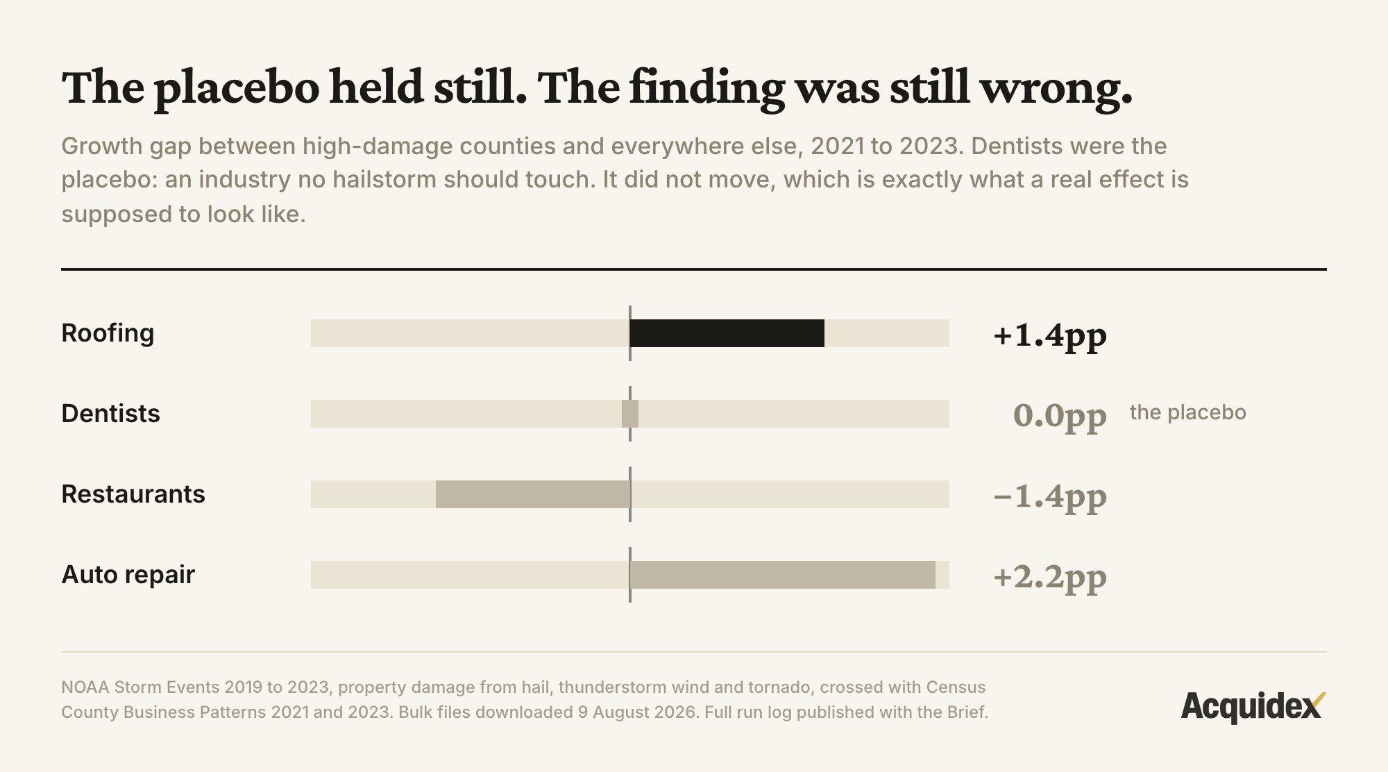
| Roofing | +7.1% | +5.7% | +1.4pp |
| Dentists | 0.0% | 0.0% | 0.0pp |
| Restaurants | 0.0% | +1.4% | −1.4pp |
| Auto repair | +2.2% | 0.0% | +2.2pp |
Now the placebo is flat. Dead flat, to two decimal places. And roofing is ahead by 1.4 points.
This is where a lot of analysis stops. The design looks correct, the control behaves, and the treatment moves in the predicted direction.
Two things kept me going.
First, 1.4 points is not "roughly doubled." When a replication comes back much smaller than the original, the honest reading is that both numbers are measuring noise at different sample sizes. You have not found a smaller version of the same truth.
Second, a flat placebo only rules out one kind of error: a cause that hits everything. It does nothing about a cause that hits construction but not dentistry, in the same counties, at the same time. I could not think of one, so I went and looked instead of thinking.
Check three: what else do those places have in common?
This is the one that kills most growth stories.
I printed the list of high-exposure counties by state.
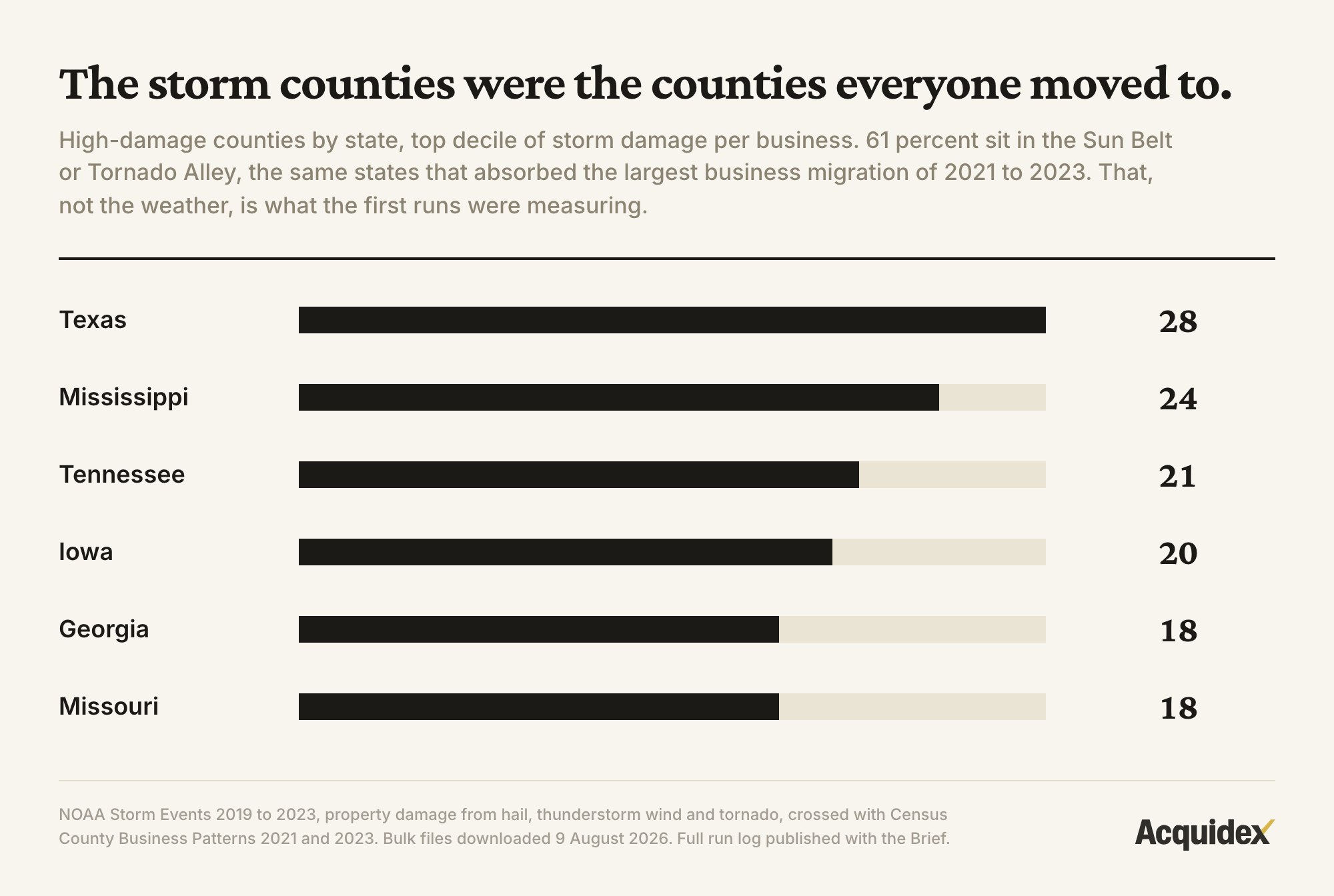
Texas 28. Mississippi 24. Tennessee 21. Iowa 20. Georgia 18. Missouri 18.
Sixty-one percent of the high-exposure counties are in the Sun Belt or Tornado Alley.
Which is not surprising — that is where severe convective weather happens. The measure is working correctly.
It is also a list of the states that absorbed the largest movement of people and businesses in America between 2021 and 2023.
So my storm measure was doing something else at the same time. It was quietly marking the counties in the part of the country everyone moved to.
Any test built on that variable will light up for anything that moved south. Construction moved south, because people moved south and needed houses. Dentistry moved south more slowly, because dental practices follow population with a longer lag and are less elastic to a building boom.
An asymmetry like that would produce exactly this kind of gap: 1.4 points, with a flat placebo. Not hail. Migration, hitting a construction trade harder than a health trade. We did not test that mechanism directly.
Geography. 61% of the high-damage counties sit in the Sun Belt or Tornado Alley — the same states that absorbed the largest business migration of 2021 to 2023. The storm variable was functioning as a regional marker, and construction is more elastic to in-migration than dentistry is, which reproduces exactly the pattern a real storm effect would produce.
Check four: what happens when you compare like with like?
The fix is to stop comparing Texas to Vermont.
If the problem is that storm exposure encodes geography, hold geography still. I ran it again with every state as its own separate contest: a storm-hit county in Texas compared only against other Texas counties, Alabama against Alabama. Within each state, the hardest-hit counties against the rest of that state, then the median of the state-level gaps.
Migration into Texas now affects the high and low groups equally, because both groups are in Texas.
| States tested | Median gap | States where it held | |
|---|---|---|---|
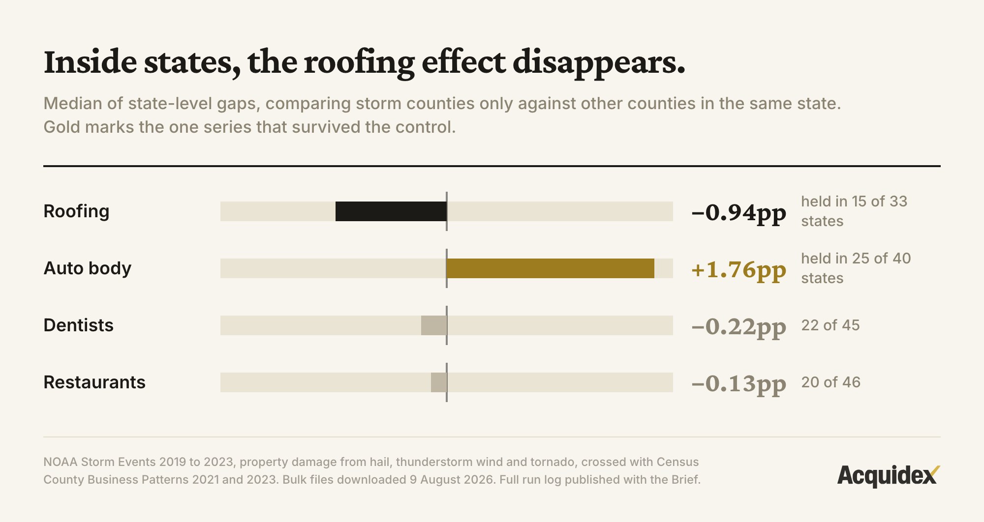
| Roofing | 33 | −0.94pp | 15 of 33 |
| Auto body | 40 | +1.76pp | 25 of 40 |
| Dentists | 45 | −0.22pp | 22 of 45 |
| Restaurants | 46 | −0.13pp | 20 of 46 |
Roofing collapses. The median gap is slightly negative and the effect appeared in 15 states out of 33 — a coin flip, which is what nothing looks like.
Note the placebos. Dentists at −0.22 with 22 of 45. Restaurants at −0.13 with 20 of 46. Both sit at approximately zero with about half the states positive, which is precisely what a null looks like in this test. That is how I know the method works rather than having broken something.
The entire national result was geography.
The effect disappears. Restricting comparisons to counties within the same state, roofing falls to −0.94 points and holds in 15 of 33 states. The placebos land near zero with roughly half the states positive, confirming the test is working rather than broken. The national result was geography the whole way through.
What happens when you compare a county to itself?
Every check above compares different places to each other. That design carries a permanent weakness: places differ in a hundred ways you did not measure, and here one of them was migration.
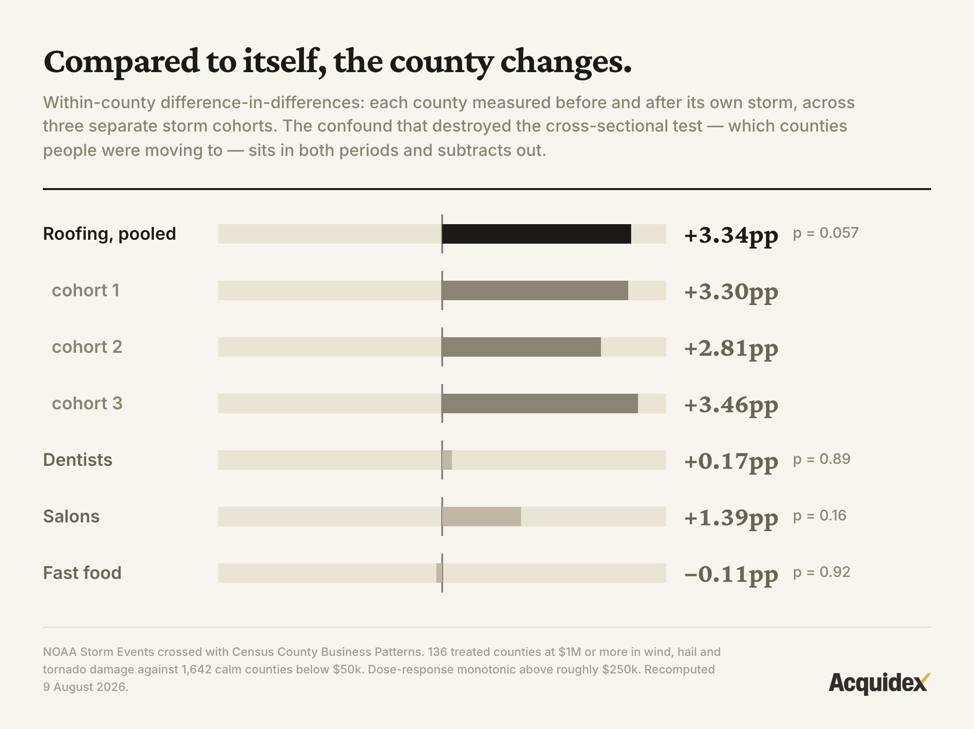
There is a way around it. Stop comparing counties to counties. Compare each county to itself, before and after its own storm. Because storms hit different counties in different years, that yields three separate cohorts, each with its own timing — three experiments rather than one.
Roofing gains 3.34 points of excess growth, pooled across the three cohorts, at p = 0.057. The per-cohort figures are +3.30, +2.81 and +3.46: three separate storm windows, three nearly identical answers. The dose-response is monotonic above roughly $250,000 of damage. And the placebos are null — dentists +0.17 (p=0.89), salons +1.39 (p=0.16), fast food −0.11 (p=0.92) — across 136 treated counties against 1,642 calm ones.
Why did the two designs disagree?
Because they ask different questions.
The cross-section asks: are storm-hit counties different from other counties? Answer: yes, but mostly because of who moved there. The storm variable was carrying a map of the American South.
The difference-in-differences asks: does a county change after its own storm? Answer: roofing gains about three points, three times in a row, with the placebos flat.
The confound that destroyed the first design is exactly what the second one removes. If a county is growing because people are moving to it, that growth sits in its numbers both before and after the storm, so comparing the county to itself subtracts it.
So the honest summary is narrower and more useful than either headline. Storms do appear to grow roofing businesses, by roughly three points, temporarily — and nowhere near enough to explain a doubling. The spectacular version of the story was geography. The modest version is weather.
A seller with a post-storm growth story is not lying. They are quoting the wrong number.
They answer different questions. Comparing storm counties against other counties asks whether those places are different, and they are — because of migration. Comparing each county against itself before and after its own storm asks whether the storm changed anything, and it did, by about three points across three cohorts with null placebos. The confound that killed the first design is the one the second design differences away.
Does the surviving result survive being attacked?
Four ways it could still be wrong, tested in order.
Is 3.34 points just noise? p = 0.057 is at the edge of conventional significance, not inside it. What makes it worth reporting is not the pooled p-value but the consistency underneath it: three independent cohorts at +3.30, +2.81 and +3.46. A single cohort at that p-value would not be worth writing about. Three agreeing to within seven-tenths of a point is a different kind of evidence.
Could the placebos be badly chosen? They are the strongest part. A placebo only rules out a cause that hits everything; the migration confound hit construction trades and largely spared dentistry, which is why a flat dentist did not save the cross-sectional test. Under the within-county design the placebos are flat and the confound they missed has been differenced away, so they are doing real work this time rather than providing false comfort.
Does the effect scale with the cause? Yes, and this is the check that moved me most. Growth rises monotonically with damage above roughly $250,000. A confound has no reason to line up in dose order; a causal mechanism does.
Is it a quirk of the method? Plumbing and HVAC were run through the identical design and died. If the within-county specification simply manufactured positive results, they would have survived too. Only roofing responds, which is a point in favour of the result and also a limit on it: this is one trade, not a law about storms and trades.
And the honest counterweight: the null direction is under-attacked in the other direction too. The within-state test failing does not prove absence — 33 states with a median gap near zero is a design that would struggle to see a three-point effect at all. Neither result is strong enough to overturn the other on its own. That is why both are published.
Where the theory nearly fails
The boundary case is auto body repair, and it cuts against the tidy story.
Auto body is the one series that survived the within-state comparison, at +1.76 points across 25 of 40 states. On a coin-flip assumption, 25 of 40 lands at roughly p = 0.08 — suggestive, not settled, and reported here because leaving it out would be selective.
It matters because it is the trade with the most obvious mechanism. Hail wrecks cars; paintless dent repair is a real business with real shops. If storms grow anything, they should grow this. That it survives the design which killed roofing's cross-sectional result, while roofing needs a different design to show up at all, is a reminder that these two industries may respond on different timescales — cars are repaired in weeks, roofs over seasons — and that a two-year window measured at endpoints treats those identically.
The row that does not fit is plumbing and HVAC. Under a size-matched comparison they showed +4.87 points; under difference-in-differences that collapsed to +0.41. They look like roofing, they sit in the same counties, and they do not respond. Any theory that says "storms grow the trades" has to explain them, and cannot.
What survived the test?
Auto body shops. Up 1.76 points, holding in 25 of 40 states.
Twenty-five out of forty is 62% — not overwhelming, but meaningfully different from the coin flip roofing produced, and it survives the control that killed roofing.
The mechanism is obvious once the number appears. Hail destroys car panels, paintless dent repair is a genuine trade with genuine shops, and a serious hail event in a populated county produces thousands of damaged vehicles in an afternoon.
The size is right too. Real effects in establishment counts over two years are small. A result claiming roofing doubled should have prompted suspicion rather than satisfaction.
I am not writing that article yet. It deserves a hail-only exposure measure rather than hail mixed with wind and tornado, and more than one storm window. But it has the shape of a true thing: small, specific, mechanically sensible, and undisturbed by the obvious control.
The complete run log
Every run, in the order I did them, including the ones that looked like findings. A null-result piece that only shows the runs supporting its conclusion is the same failure it is warning about.
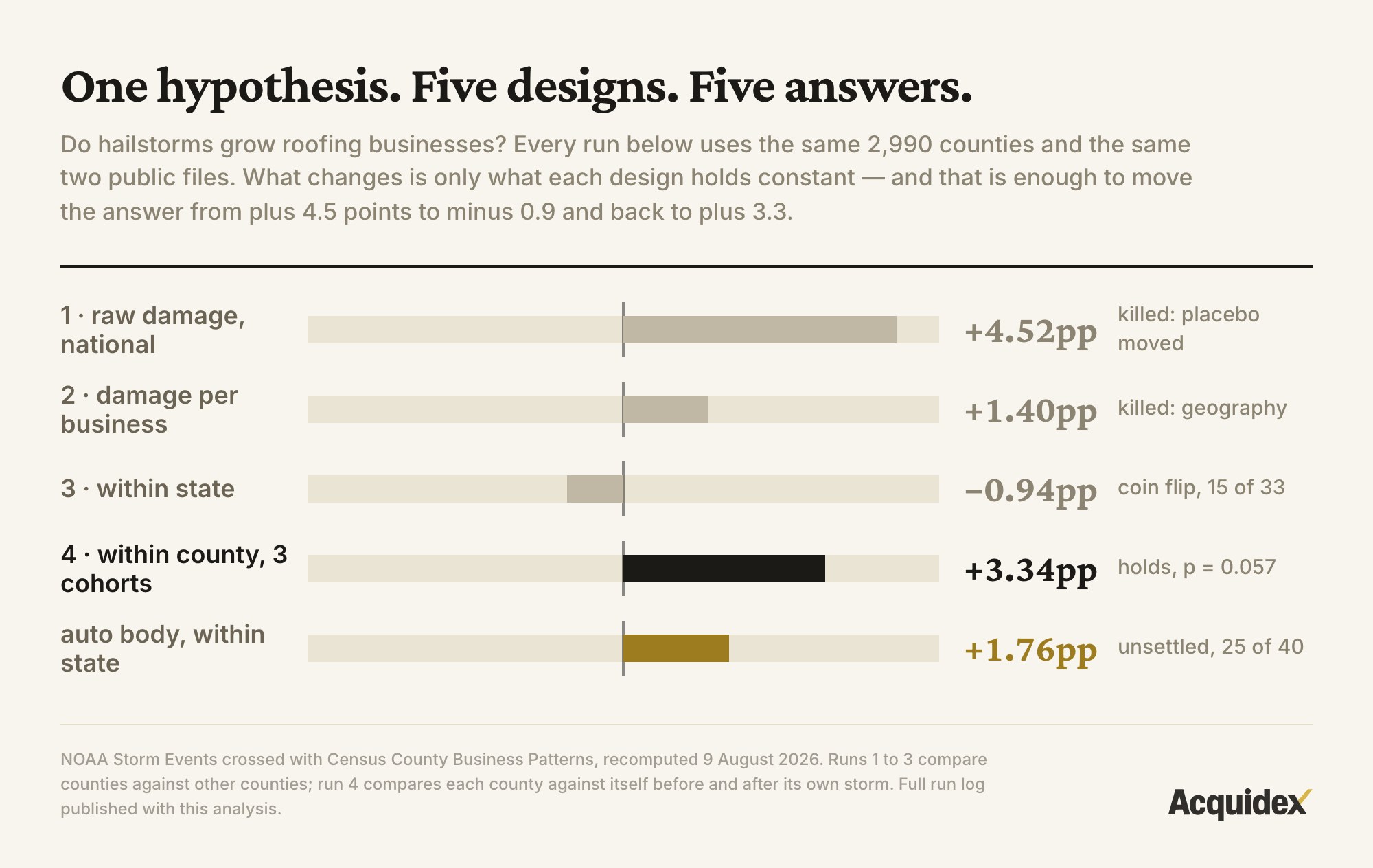
| # | Design | Exposure measure | Comparison | Roofing | Placebos | Verdict |
|---|---|---|---|---|---|---|
| 1 | Cross-section | Raw storm damage, >$50M vs near-zero | All counties, nationally | +4.52pp | Dentists +3.70pp | Killed. Placebo moved. Measure was proxying county size |
| 2 | Cross-section | Damage per business, top decile vs bottom half | All counties, nationally | +1.4pp | Dentists 0.0pp, restaurants −1.4pp, auto repair +2.2pp | Believed for 20 minutes. Clean placebo, wrong answer |
| 3 | Cross-section | Damage per business, within state | Counties vs others in the same state | −0.94pp, held in 15 of 33 | Dentists −0.22 (22 of 45), restaurants −0.13 (20 of 46) | Killed. Coin flip. Exposure was proxying migration |
| 3b | Cross-section | Same | Same, auto body | +1.76pp, held in 25 of 40 | — | Survives, unsettled (≈p=0.08) |
| 4 | Within-county DiD | ≥$1M damage vs under $50k, three storm cohorts | Each county vs itself, before/after | +3.34pp pooled, p=0.057 | Dentists +0.17 (p=0.89), salons +1.39 (p=0.16), fast food −0.11 (p=0.92) | Holds. Cohorts +3.30 / +2.81 / +3.46; dose-response monotonic |
| 5 | Within-county DiD | Same design, plumbing and HVAC | Each county vs itself | +0.41pp (from +4.87 size-matched) | — | Killed. Only roofing responds |
The obvious objection: I ran five designs and am reporting the one that survived. That is the shape of a specification search and it is fair to hold against me. Two things separate it from fishing. The five were not five attempts at one question: each fixed a specific flaw the previous one exposed, and the order was set before the last result was known. And the surviving estimate does not rest on its p-value alone, since three separate storm cohorts land within half a point of each other, the effect rises with damage, and three placebos stay flat. None of that follows from an arbitrary fifth cut. Even so, p=0.057 across five specifications is weaker than p=0.057 from one, and no correction has been applied.
Two of the five designs produced a publishable-looking number that was wrong. One produced a result that holds. The difference between them is not effort or sample size — every run used the same 2,990 counties — it is what each design was willing to hold constant.
Why does this keep happening?
Once you have seen this failure mode you start seeing it everywhere, because the pattern is always the same. You have a cause you want to test. You measure it. Your measure is correct. And your measure happens to also be a map of somewhere.
Storm damage per business is a real quantity, computed correctly. It is also, by accident, a map of the American South.
Anything that varies by region does this. Weather. Water rights. Union density. Housing cost. Licensing regimes. Winter. Each is a real thing worth studying, and each is also a label for a set of states that differ in a hundred other ways.
So the test becomes circular without anyone noticing. You ask whether storms grow roofers. What you actually asked was whether the South grew faster than the Northeast. It did, for reasons that have nothing to do with hail.
The tell is when the treatment group has a geography. Write down where the affected businesses are. If the list reads like a region rather than a scatter, the test has not been run yet.
The fix is cheap: comparing within states took about ten minutes once the data was loaded. The expensive part was being willing to run it after I already had a number I liked. That is the actual failure mode. Not incompetence. Momentum.
Why this matters more to a lender
A buyer gets one growth story to evaluate. A lender gets hundreds, and that changes what the mistake costs.
If a credit box treats trailing growth as a quality signal and some of that growth is a place rather than a business, the box is quietly concentrating — not by industry, which anyone would notice and which every policy already limits, but by geography and by vintage.
Picture a book of loans written in 2023, weighted toward businesses that showed strong 2022 growth. A meaningful share of that growth was migration into a handful of Southern metros. Those businesses look diversified on paper: by NAICS code, by borrower, by branch, by loan size.
They are not diversified by cause. The same thing was making all of them grow, and the same thing stopping is a correlated event across the book. It will not appear in any concentration report, because no report has a column for it.
This is the ordinary way concentration hides. Nobody writes down "we are long the Sun Belt." It accumulates one defensible credit decision at a time.
What does this mean for buyers and sellers?
For buyers, when a seller explains why revenue grew, run these seven.
- Ask what else changed at the same time. Not what they did — what happened to them.
- Ask whether the neighbors grew too. If every business in that county grew, the reason is the county, and you are buying an economy rather than a company.
- Find the dentist. Name a business nearby that should not have benefited. Check whether it grew anyway.
- Ask if the cause is still running. Insurance money, a one-time contract, a competitor closing, a stimulus program. Those end, and the trailing average does not know it.
- Ask for the year before the story starts. A growth story beginning exactly when the trailing window begins is a window, not a story.
- Check whether customers are new or orders are bigger. One-time events usually show up as bigger orders from existing customers; durable growth usually shows up as more customers.
- Ask what happens in that market over the next three years. If the answer requires another storm, another program or another boom, you are buying the last one.
For sellers, the same logic runs in reverse and it is worth getting ahead of. If a meaningful part of recent growth came from something external — a competitor closing, a one-off contract, a local boom — a competent buyer will find it, and finding it late costs more than disclosing it early. The stronger position is to separate the two yourself: here is the growth that came from the market, here is the growth that came from the business, and here is the evidence for the split. A seller who has already done that arrives with a credibility advantage that survives diligence.
Three common misconceptions
A control group makes a result safe. I had a perfectly clean placebo — dentists at exactly zero while roofing was up 1.4 points — and the cross-sectional answer was still wrong. A placebo catches a cause that hits everything. It cannot catch a cause that hits the same industries you are studying, in the same places, for unrelated reasons. Migration hit construction trades hard and dentistry barely at all, which is precisely the asymmetry a placebo is blind to.
A bigger sample fixes it. Every run used 2,990 counties — every county in America with recorded storm damage. Sample size was never the constraint. A confound does not shrink when you add data; it gets measured more precisely.
One test settles it. This is the one I got wrong, and I nearly published it. When the within-state comparison came back at a coin flip I wrote that the effect was fake. It was not fake. It was smaller than advertised and invisible to that particular design. A test that cannot see an effect has not proven the effect is absent; it has told you what that test can see. The discipline is to name which design failed and what that design was blind to.
Where I could be wrong
p = 0.057 is not below 0.05. The surviving result sits at the edge of conventional significance rather than comfortably inside it. Three cohorts agreeing and a monotonic dose-response are what make it worth reporting; a single cohort at that p-value would not be. Adding the 2015–2018 and 2022 storm cohorts would settle it in either direction.
These are establishment counts, not revenue. I measured whether the number of roofing businesses in a county changed. An existing roofer could double revenue without a single new business appearing, and that effect is invisible here — while being exactly the effect that matters to a buyer reading one company's P&L. What the data speaks to is business formation, not the income statement in front of you.
Storm chasers are unresolved. Some post-storm roofing entities are out-of-state operators registering local branches for the insurance season and leaving afterwards. County establishment counts cannot distinguish a new local business from a temporary registration, so an unknown share of the three-point gain may be firms that were never really there. That ambiguity is not a footnote for a buyer; it is the same ambiguity sitting inside a target's post-storm revenue.
The exposure measure is blunt. Hail, wind and tornado summed together, using reported property damage, which is itself an estimate produced under field conditions. Splitting hail out would be a better test and might sharpen or dissolve the result.
State is a coarse control. Texas contains Houston and it contains the Panhandle. Within-state is far better than nothing and is not the same as comparing genuinely similar places.
Two years, measured at endpoints. 2021 against 2023. A slower effect would not show, and an effect that spiked and reverted inside the window would be invisible. Cars are repaired in weeks and roofs over seasons, so the same window treats two different clocks identically.
Auto body is unresolved, not proven. Reported because leaving it out would be selective.
What would make this stronger. Earlier storm cohorts to push the pooled result decisively above or below significance; a hail-only exposure measure; entity-level records that distinguish local formations from branch registrations; and revenue rather than establishment counts, which would require QCEW or a private panel.
Sources
NOAA National Centers for Environmental Information, Storm Events Database, 2019 to 2023. US Census Bureau, County Business Patterns, 2021 and 2023. Both recomputed from the published files on 9 August 2026.
I spent a day on a story I liked and it did not survive. That is most days. It is published because the same four checks work on the growth story in the deal on your desk, and nobody else is going to run them for you.
Related: what lenders actually accept in add-backs, the DSCR thresholds a growth story has to clear, and why most sellers' businesses never reach a sale at all.

Avery Hastings, CPA
Founder, Acquidex • CPA • Tokyo, Japan
Avery Hastings is a CPA based in Tokyo, Japan and the founder of Acquidex. She focuses on helping buyers evaluate small-business deals with clear cash-flow logic, realistic downside analysis, and practical diligence frameworks.
Keep up with Avery →Sources
No external sources are cited in this article.
Keep Reading
- The Four Risks That Decide Whether an Acquisition Works11 min read read
Most SMB and lower-middle-market deals don't fail on strategy. They fail because four risks — overstated cash flow, customer concentration, owner dependency, and aggressive leverage — were each judged manageable in isolation, then compounded after close.
- How Much of a Small Business's Profit Is Actually the Owner?17 min read read
Two natural experiments on eleven million firms measured what happens when an owner leaves. Profit fell 82% after death and 83% after retirement. A replacement-salary add-back prices the same person at 17%.
- I'd Rather Find a $500,000 Problem Than a $417 Lie16 min read read
A problem changes the price. A lie changes the reliability of everything you were told, including the things that made you want the business. Diligence is a sampling exercise, and that is the whole reason the difference matters.